Lesson 2: Basic visualizations
What is ggplot?
Hadley Wickham, chief scientist at RStudio (and ISU alum!), said in A Layered Grammar of Graphics:
A grammar of graphics is a tool that enables us to concisely describe the components of a graphic.
The ggplot2 package is built around the idea of “building up a graphic from multiple layers of data.” In other words, we’re building up our plot from individual pieces, one function call at a time.
The function call for ggplot is:
ggplot(data, mapping = aes(...)) +
  <geom_layers> +
  <additional layers>
Here, each of the different objects represents a layer:
data is the data object that you would like to visualize and mapping contains the aesthetic mappings to use; that is, the mapping of which aesthetics to which variables. geom_layers are what actually draw the points onto the canvas; for example, geom_point will create a scatter plot. * There are additional layers you can use to make your graph prettier.
A ggplot call might look like:
mtcars %>%
  ggplot(aes(x = wt, y = mpg)) +
  geom_point()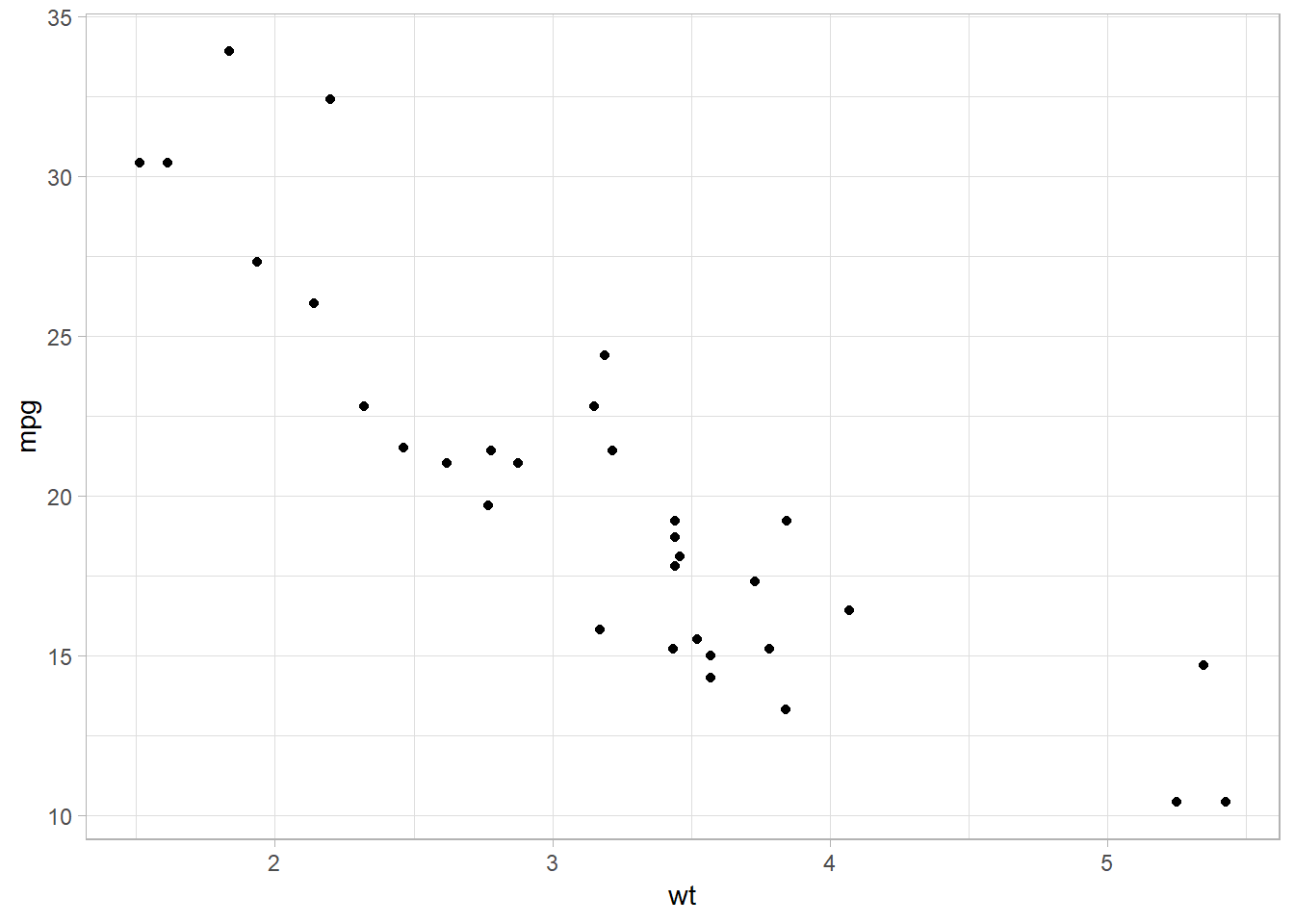
Let’s change the x- and y-axis titles to be a little more informative:
mtcars %>%
  ggplot(aes(x = wt, y = mpg)) +
  geom_point() +
  labs(x = "Weight (in thousands of lbs)",
       y = "Miles per gallon")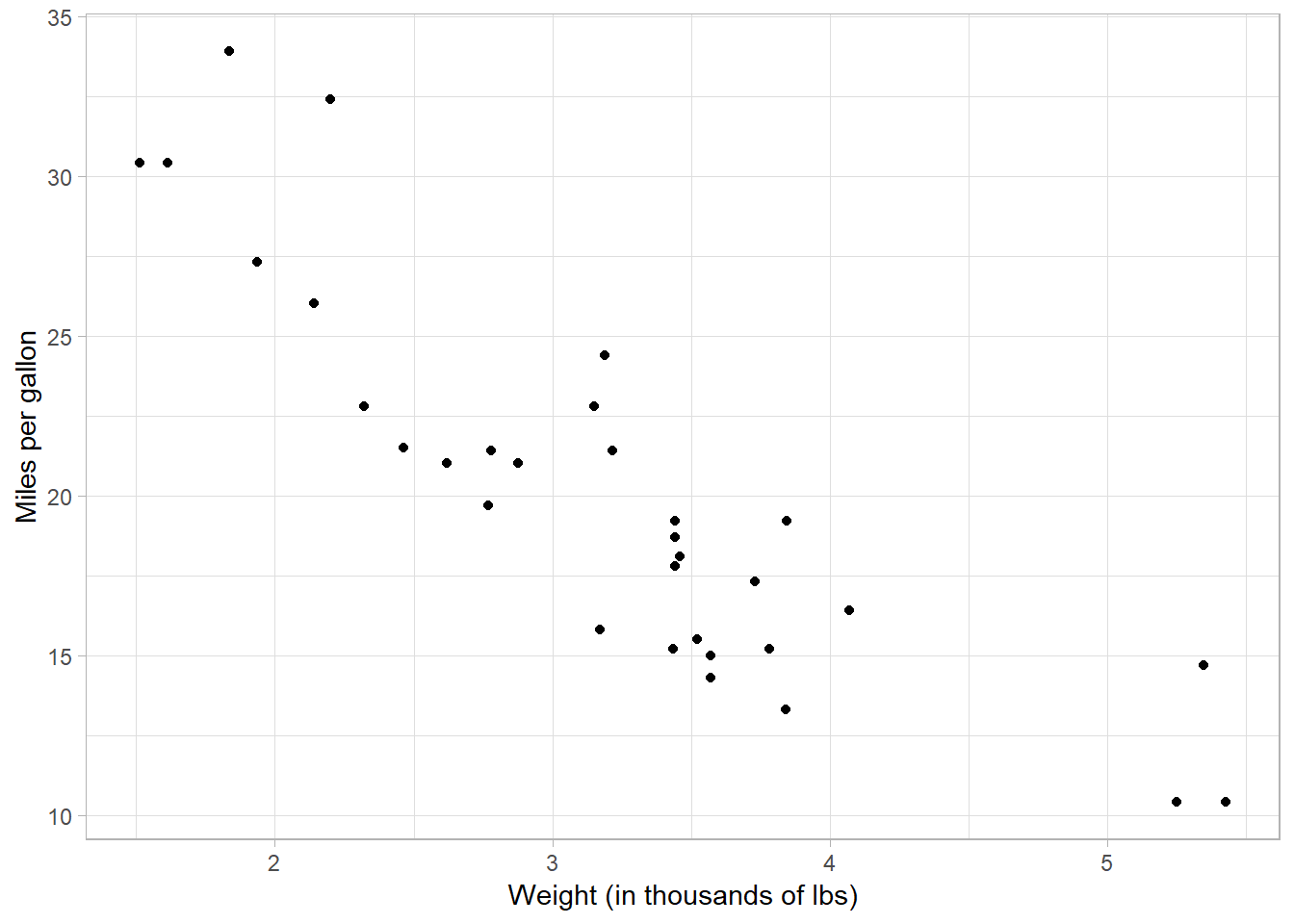
We can also introduce other aesthetics into the plot. For example, let’s color the dots by the number of cylinders they have:
mtcars %>%
  ggplot(aes(x = wt, y = mpg)) +
  geom_point(aes(color = cyl)) +
  labs(x = "Weight (in thousands of lbs)",
       y = "Miles per gallon")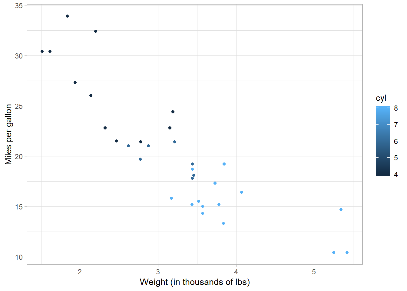
We can also change the size of the points by setting size to a specific number:
mtcars %>%
  ggplot(aes(x = wt, y = mpg)) +
  geom_point(aes(color = cyl),
             size = 3) +
  labs(x = "Weight (in thousands of lbs)",
       y = "Miles per gallon")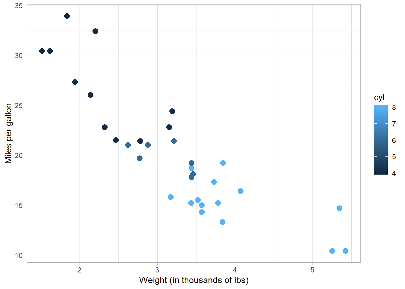
And let’s change a few more things to make the graph a bit prettier:
mtcars %>%
  ggplot(aes(x = wt, y = mpg)) +
  geom_point(aes(color = cyl)) +
  labs(x = "Weight",
       y = "Miles per gallon",
       title = "Miles per gallon versus weight for automobiles",
       subtitle = "Data from Motor Trend magazine") +
  theme_light()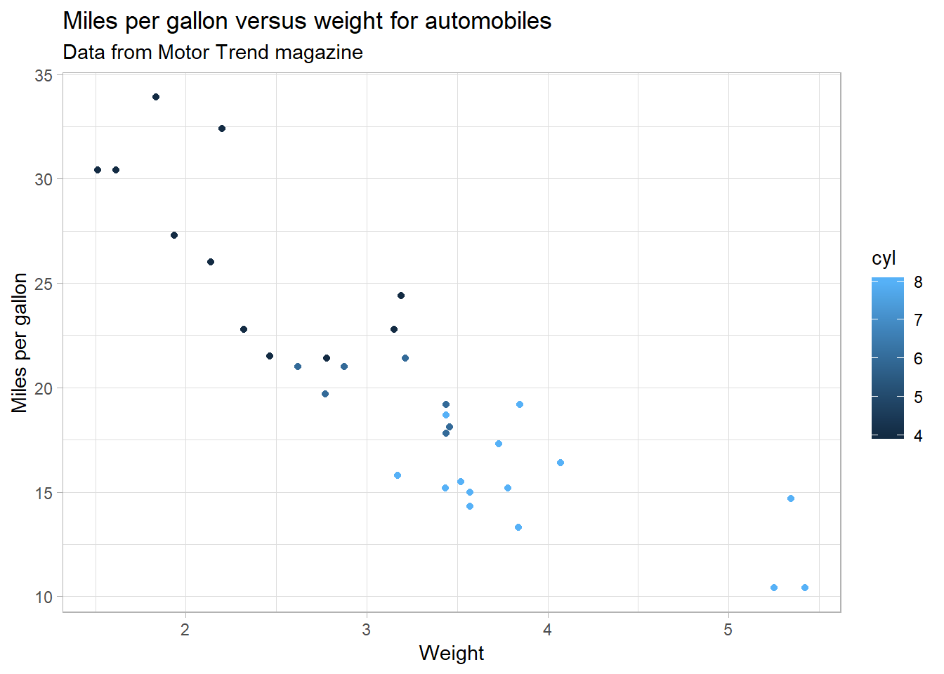
Exercises 2.1
- We colored the points according to the number of cylinders it has, but there’s something wrong with it. What is it? How can we fix it?
- What are some things we can do to improve this graph?
- What are conclusions you can draw from this graph?
- Experiment with the color aesthetic by mapping it to different variables. Try mapping another variable to the
sizeaesthetic (qsec, for instance). - Use
?theme_lightand try out a few other themes.
More practice
For the rest of the day, we’re going to work more with the flights dataset. Let’s begin by getting a histogram of the flights using geom_bar:
flights %>%
  ggplot(aes(x = carrier)) +
  geom_bar()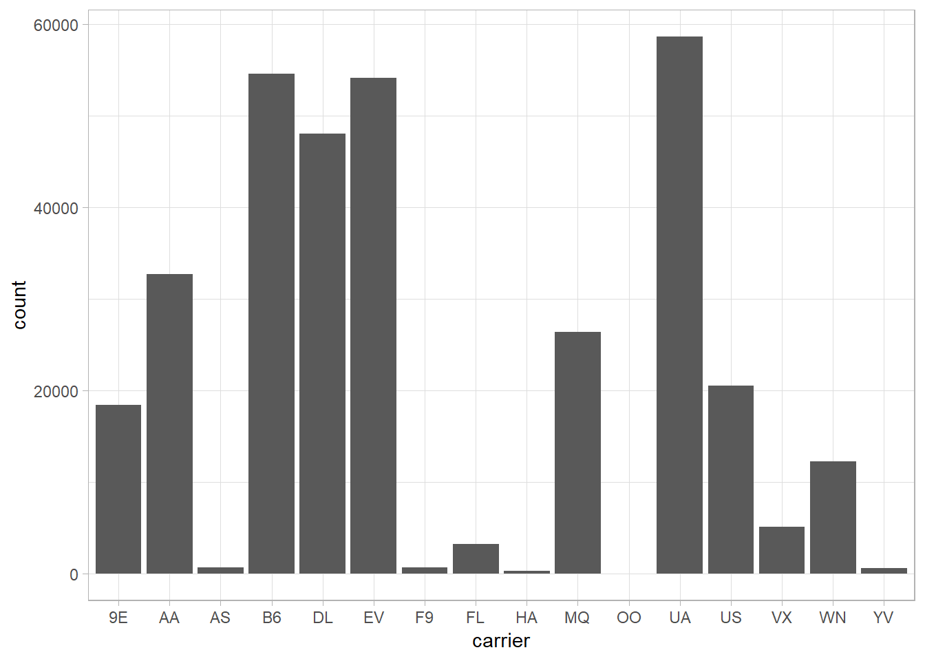
We can look up the airline codes by using airlines. Doing so, we see that United Airlines, JetBlue, and ExpressJet Airlines have the most flights out of New York in 2013.
airlines %>%
  filter(carrier %in% c("UA", "EV", "B6"))
## # A tibble: 3 x 2
## carrier name
## <chr> <chr>
## 1 B6 JetBlue Airways
## 2 EV ExpressJet Airlines Inc.
## 3 UA United Air Lines Inc.Let’s fill in the bars with the name of the origin airport:
flights %>%
  ggplot(aes(x = carrier, fill = origin)) +
  geom_bar()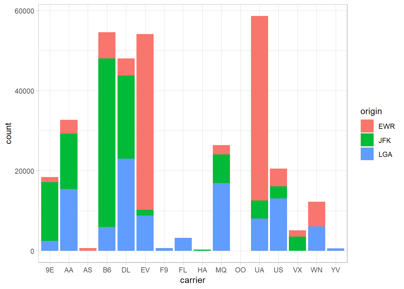
Let’s polish the graph a little:
flights %>%
  ggplot(aes(x = carrier, fill = origin)) +
  geom_bar() +
  labs(x = "Carrier",
       y = "",
       title = "Number of flights from New York airports by carrier",
       fill = "Origin")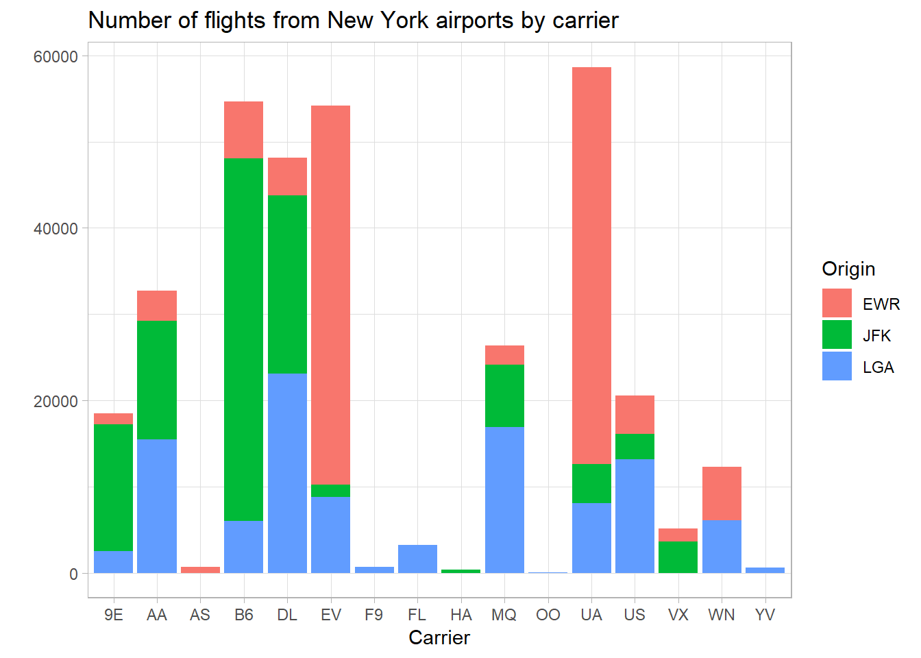
Next, let’s try and use the full carrier name. We have access to the carrier name from the airlines list. We will use inner_join to add the information from airlines to the flights data:
flights %>%
  inner_join(airlines, by = "carrier")
## # A tibble: 336,776 x 20
## year month day dep_time sched_dep_time dep_delay arr_time
## <int> <int> <int> <int> <int> <dbl> <int>
## 1 2013 1 1 517 515 2 830
## 2 2013 1 1 533 529 4 850
## 3 2013 1 1 542 540 2 923
## 4 2013 1 1 544 545 -1 1004
## 5 2013 1 1 554 600 -6 812
## 6 2013 1 1 554 558 -4 740
## 7 2013 1 1 555 600 -5 913
## 8 2013 1 1 557 600 -3 709
## 9 2013 1 1 557 600 -3 838
## 10 2013 1 1 558 600 -2 753
## # ... with 336,766 more rows, and 13 more variables: sched_arr_time <int>,
## # arr_delay <dbl>, carrier <chr>, flight <int>, tailnum <chr>,
## # origin <chr>, dest <chr>, air_time <dbl>, distance <dbl>, hour <dbl>,
## # minute <dbl>, time_hour <dttm>, name <chr>Now we have an additional column at the end for the full name of the carrier. Let’s revisit our earlier graph with this new information:
flights %>%
  inner_join(airlines, by = "carrier") %>%
  ggplot(aes(x = name, fill = origin)) +
  geom_bar() +
  labs(x = "Carrier",
       y = "",
       title = "Number of flights from New York airports by carrier",
fill = "Origin") 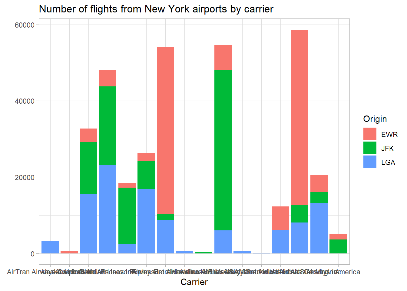
Exercise 2.2
- The text at the bottom is super cluttered now. Look up
?themeand look ataxis.text.xto learn how to rotate the text. Feel free to search online, also. - The
airportsdata contains full airport names for several airports. Repeat theinner_joinprocess above to combine this information into the data frame above. Look at the resulting data frame. What do you see different here? How can you use what you’ve learned today to fix this? Hint: One solution is to usemutate. - There’s a lot of information on the chart, and stacking the bar plots might not be the most informative way to present it. Look up
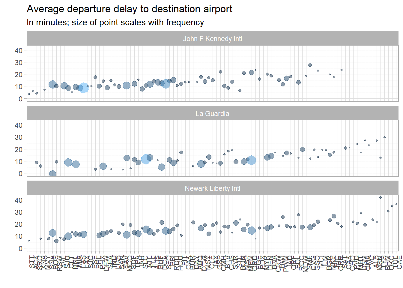
facet_wrapand use it to separate the chart into there separate bar plots. Alternatively, read the Details section of the documentation forgeom_barfor another way to address this problem. - Reproduce the following graph (borrowed heavily from Alexandra Chouldechova). How can it be improved?
- Next section: Next steps
Paul Villanueva
Ph.D. Student - Bioinformatics and Computational Biology
Iowa State University, Ames, IA.