Impact of treatment on abundance of corn and Miscanthus Gigantus
Which genes should we remove?
Since we’re interested in what makes the samples different, we’ll start by removing non-informative genes from our samples. For this first pass, we’ll say that a gene is non-informative if it isn’t present in the majority of samples across both treatments. We’ll start by getting the number of non-detects for each gene in each sample group:
We can use non_detect_counts to get the number of non-detects from each gene. For example:
non_detect_counts %>%filter(amoA =="amoA.001")
# A tibble: 2 x 4
# Groups: fert_level, amoA [2]
fert_level amoA non_detect n
<int> <chr> <lgl> <int>
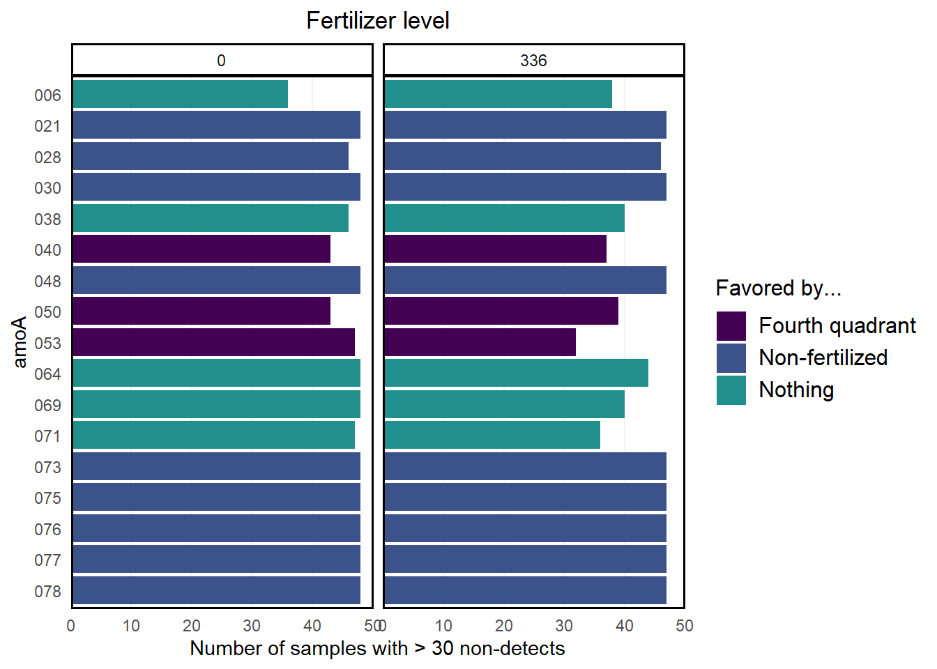
1 0 amoA.001 TRUE 38
2 336 amoA.001 TRUE 9
This tells us that amoA.001 was not detected in 38 of the non-fertilized samples and in 9 of the fertilized samples.
From here, we’ll remove genes that were not detected in at least 30 samples in both the fertilized and non-fertilized samples. This cutoff is chosen arbitrarily.
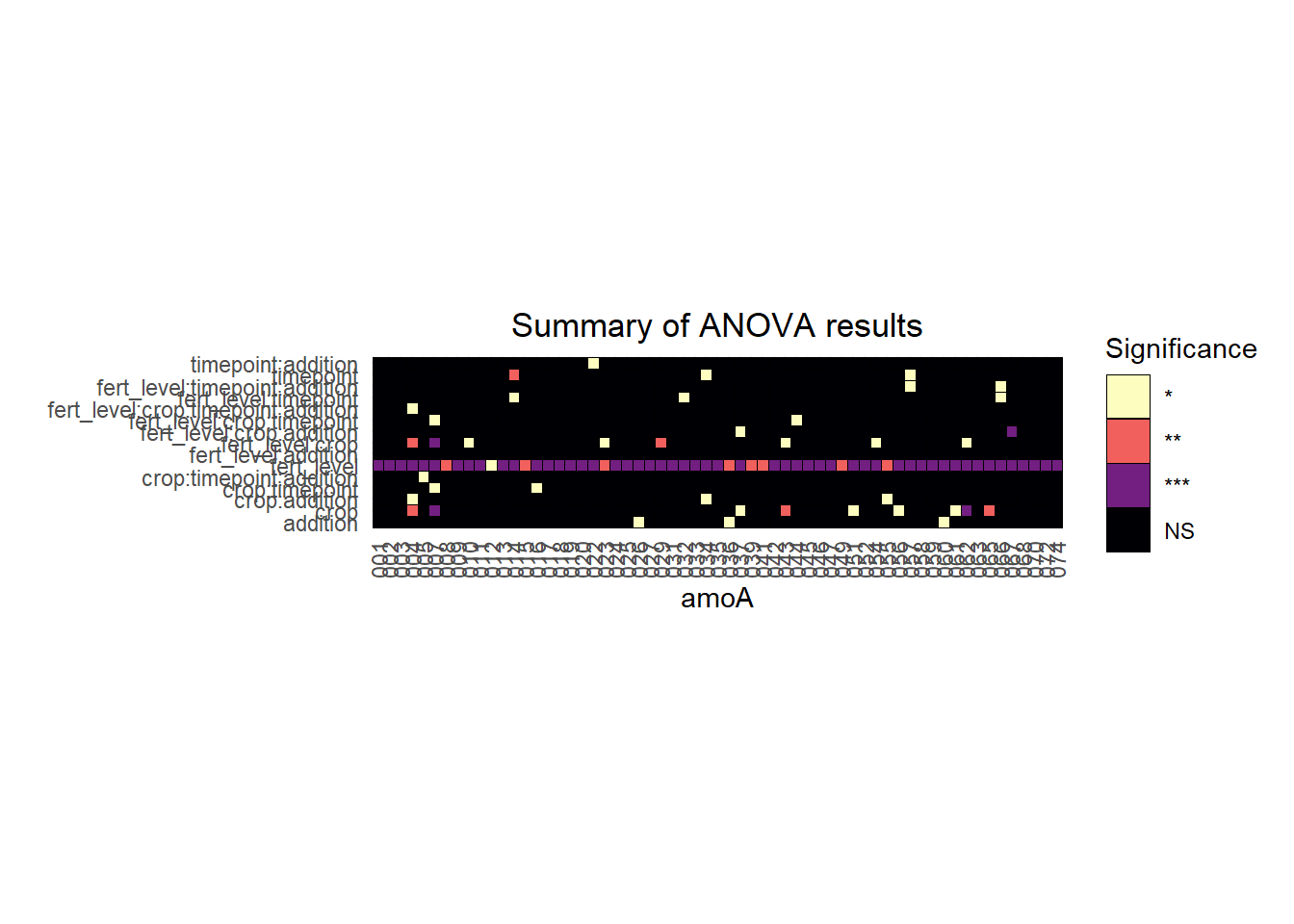
We can then visualize the anova results in a heatmap. Here, each column represents a gene, the rows represent the factors being tested by the ANOVA, and the colors indicate the significance of the ANOVA test.